How to Criticize Your Own Story (& Why You Should Do It)
Our kitchen has a horrible faux-marble tile floor.
Each piece of tile is set in the same direction, creating a repeating pattern of gray swirl that I swear looks like a seagull in flight. (My husband sees the outline of the United States.)
I hate the tile. I hate it so much that I considered not purchasing the house. But because the rest of the house worked, and because my husband and I decided we would redo the floor immediately after purchase, we went ahead with the deal.
That was four years ago. And the tile is still here.
Why? 1. Overwhelm. 2. Familiarity.
We had every intention of getting rid of that tile right away. But what seemed like a small project quickly escalated.
The current tile runs under the cabinets. So if we want a new floor, do we install it under the cabinets? And if we’re taking out the cabinets, should we just get new ones? Should we just redo the entire kitchen?
Overwhelm sets in. The decision is put off.
And so we live with it. And I got used to it. And now, I don’t even notice the seagull screaming hello! to me every morning. It’s something that has become so familiar that it’s hard for me to feel strong emotions about.
Overwhelm + familiarity happens in marketing — in storytelling — as well.
You get so used to reading something about your school, or seeing something on your website, that you don’t really see it anymore. Images are blurred. Words become meaningless. It happens to everyone.
But it doesn’t happen to the person reading it or seeing it for the first time. And that person is looking at it, or reading it, and making snap judgments and decisions about you.
That’s why it’s so important to be your story’s biggest, constant critic. To never let your content sit too long without reviewing it with a fresh, critical eye.
So how can you avoid the dreaded storytelling overwhelm + familiarity? Start by asking yourself these questions the next time you look at a piece of your content:
- Is this the way I would want someone to describe this school to someone else?
- Are these words honest and authentic? Can these claims be supported, or are we trying to be something we’re not?
- Is the voice and tone of this copy a true reflection of what it’s like to be part of our community?
It’s a good little test — and an important one.
So important, in fact, that we tested ourselves recently here at Cursive Content Marketing. And we found that our current story — the one that we created back when we launched two years ago — needed an overhaul.
So we tore it down and built it back up.
And the biggest reflection of that process is our new website. Here’s how we did it:
First, we went back to our basics. Storytelling.
Our content is our core. So we transformed our website structure and made our blog our homepage. We made it much easier to subscribe by adding a prominent sign-up area right at the top of the site. We also simplified navigation and added stronger sidebar content.
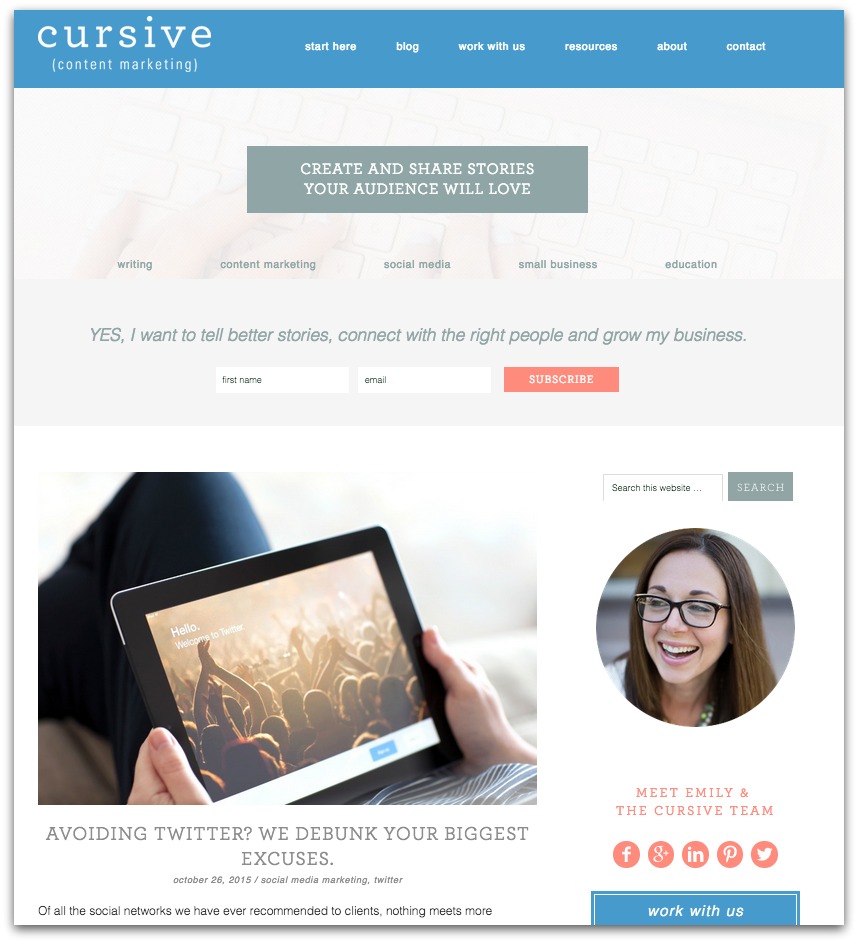
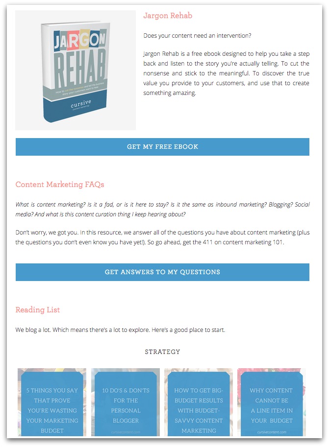
We restructured the entire site around our content, making it easier for readers to find the content they’re looking for. This included adding a Resources page that provides easy access to our ebook, content marketing FAQs, and top blog posts.
Our story critique was not only focused on website user experience. We looked at our own sweet spot and realized it needed refining and focus. So that’s why you’ll see two phrases woven throughout our site:
Create and share stories your audience will love makes a promise to our readers – that our content is here to help you tell a better story, a story that is meant to please your audience.
Storytelling and strategy for schools tells you what we do and who we do it for. We work a lot with independent schools and higher education institutions, and we love supporting this audience. It’s a niche we want to nurture.
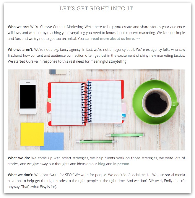
We also wanted readers or potential partners to understand who we are and what we do. So we got down-and-dirty honest on the Start Here page. It lays out who we are (and who we aren’t), what we do (and what we don’t), and who we work with (and who we don’t). We can’t and don’t want to be everything to everyone. And we want people to understand this up front.
As part of our story critique, we looked at our services and how they were offered. We created project and service buckets to streamline our offerings and focus on the services we found make the biggest impact for our audiences.

With the help of The Nectar Collective (which designed the entire site), we created a new system for imagery that not only allows us to capture the essence of each post with beautiful photography, but also optimize each post for social sharing. (You can see the Pinterest-optimized image at the top of every new post, including this one).
By being our own biggest critics, we were able to reclaim our story.
It took time and resources, but it was well worth it. Why? Because we are now confident that this site matches our vision for our company, our relationships with clients, and our promise to readers.
We’d love to hear what YOU think about the new site — and the process of critiquing your own story. Talk to us in the comments below.
MORE ARTICLES
-
 The Hidden Gap Between Your Mission Statement and Enrollment Growth
 -
 Why “Strong Academics & Caring Community” Aren’t a School Story
 -
 Busy, Scattered, Exhausting: What’s Really Wrong With Your School Marketing
 -
 Why Most Schools Don’t Actually Have a Clear Story
 -
 Clarity in 50 Words or Less: How to Write Your School’s One-Sentence Story
 -
 The 4 Building Blocks of a Strong School Story (and Why AI Needs Them)
 -
 How to Stop ChatGPT from Making Your School Sound Generic
 -
 What Should Your School Do with Its Blog Now That AI Is Changing Search?