How To Make Your Business Content Irresistible on Pinterest

Want to get your online content in front of a dedicated, captivated audience of 70 millions users – and 28% of all online adults?*
Then you need to get on Pinterest.
Yes, Pinterest, the highly visual social platform that, until somewhat recently, was best known for finding fashion and DIY inspiration. Pinterest, however, is so much more. It’s now proven to be a highly effective lead and sales generator. In fact, 83% of Pinterest users would rather follow a brand than a celebrity on the platform.**
So how do you use such a visual platform to promote your written content?
It’s all about creating an irresistibly pinnable supporting photo.
What does this mean? It means the image you choose to support your content is critical.
This doesn’t mean you have to have top-quality original photography (although that helps, of course). It means creating an eye-catching visual that entices viewers to click through and read your content.
Let’s break down why.
While Pinterest isn’t as fast-moving as Twitter, user behaviors are similar. Pinterest users quickly scroll through their home feeds until something catches their interest. When they are intrigued, they either pin that visual to their own boards, or click through to find out more about that visual from its original online source.
The description that supports each visual is secondary, there to read once the visual has already captured the user’s attention.
That’s why it’s so important to use Pinterest’s valuable visual real estate to engage with your audience.
How can you make your content’s image Pin-worthy?
If you’re already working hard at content marketing, your online content should have an engaging headline that speaks to your audiences’ needs and draws them in.
Let’s put this headline to work.
You want to add your headline to your blog image so that when you (or your fans) share your post on Pinterest, the blog headline is part of the visual.
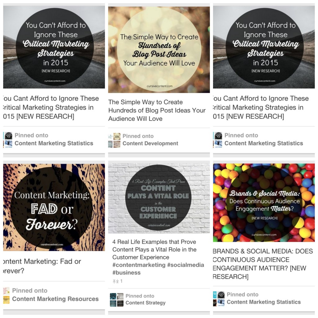
What does this look like? Here are some of our most recent Pinterest pins:

You’ll see that for each blog post we publish, we find a supporting image and add our headline text directly onto the image. We choose to use abstract image backgrounds and make our headlines the focal point, but your creative direction can be entirely your own. Even if the image itself is your visual focal point, you should still add your content’s headline somewhere on the image.
Remember: Your supporting image should be created and included in your content BEFORE you publish your content online. Your image should be part of your blog post, article or white paper, so that your readers can pin it, share it and return to your content.
OK, how do I make such a Pin-tastic visual?
Believe me, you can do it yourself – no design support or Photoshop knowledge required. (Eek, sorry designer friends.)
There are a variety of free tools out there, but our favorite here at Cursive is PicMonkey.
PicMonkey is a free service that lets you add text, filters, embellishments and more to images from your computer, Dropbox, Facebook or Flickr. It even includes easy “canvas” templates that help you size imagery to fit within specific social platforms (such as your Facebook cover photo). It’s amazing.
With an image editor like this one, you can take your content visual from pin-jured to pin-errific in no time. Here’s how:
- Upload your photo. It’s as simple as a drag and drop.
- Select the “Tt” function (“add text’) from the editor toolbox.
- Type in your headline, and format using text that aligns with your brand standards. (Don’t go rogue, people. Stick to your brand fonts).
- Add your brand logo and/or URL. This provides important brand recognition for those pinners too lazy or distracted to click through to the original source.
- Save.
- Insert into your online content.
And voila! You have a visual that supports your content, supports your brand, puts your hard-written headline to work, and makes your content incredibly pinnable.
BONUS TIP!
Now that your online content is supported by strong visuals, prompt readers to pin from your pages by adding the Pin It button. Pinterest explains how in their Pinterest for Business – Tools section.
For more tips on crafting and sharing a story that will engage your audience and grow your business, sign up for our eNewsletter using the form below. And follow us on Pinterest to see more of our pin-tastic content.
MORE ARTICLES
- 20 Best Productivity Tips for Small Businesses
- Feeling Blah? Get Your Groove Back with These 3 Tips
- Happy Holidays from Cursive Content Marketing
- This Is What Happens When the World’s Fastest Growing Fitness Craze Thinks Outside the Box
- Finding Your Voice: 20 Best Tips for Creating Authority, Authenticity and Individuality in Your Content Marketing
- 20 Best Tips for Setting, Tracking and Measuring Content Marketing Goals
- Content Marketing Summer School for School Communicators: Top Article Roundup
- What Does the Term "Content Marketing" Mean to You?