Does your content resonate with your audience? If you aren’t sure, Google Analytics can help you find out.
The data in Google Analytics has a lot of insight to provide about your content successes and failures. But first, you need to know what the numbers mean. Then you need to know what you can do to improve those numbers.
Get started with Google Analytics
When you log in to Google Analytics, you will be directed to the Audience>Overview page. If you’re new to Google Analytics, familiarize yourself with a few features:
- Date Range: Look at the top right of your screen and you’ll see a date range. You can change that range to any dates you wish, except for the current date.
- Hourly/Day/Week/Month View: This is located a bit below the date range. Within the date range, you can choose to look at the data on an hourly, daily, weekly or monthly basis.

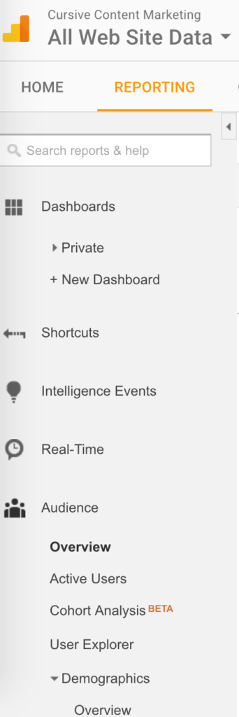
- Navigation: Located on the left is the navigation that will take you through all the datasets.

Before we dig into the reports, it’s important to note that with most Google Analytics data, we won’t identify numbers that are inherently “good” or “bad”.
The most important part of understanding the analytics is that you view the data within the context of your unique website.
Audience>Overview: Pages/Session
This indicates the number of pages a visitor viewed during their time on your site.
This is a great example of the fact that there are few definitive “good” or “bad” numbers. At Cursive, our pages per session hover around three. Given that our website is fairly small (seven pages, plus the blog), this number feels good to us. It indicates that people are coming to our site and are directed to additional content before they leave.
Three might not be such a comfortable number if we had a 500-page website. By the same token, a higher number isn’t necessarily better. A high number of pages per session could mean that your website navigation requires too many clicks, or that important information is buried multiple pages deep. This is why the analytics data needs to be analyzed alongside your actual page content and website structure.
What to do if you want to address your pages per session:
- Add calls-to-action where they’re missing
- Review your content for opportunities to link to other related pages or posts
- Review your website navigation and see how many clicks it takes to get to that specific page. Can you do anything to reduce the clicks or make this page more prominent?
Audience> Behavior> New vs. Returning
New visitors are a great sign that people are discovering your website. Returning visitors are a great sign that people like your website (because they’re coming back for more).
You want to keep a good balance of new and returning visitors because it’s an indicator you’re doing a good job at both attracting people and retaining their interest. Keep an eye on these percentages and monitor how they flow over time.
What to do if you think your New vs Returning ratios are off:
- Ensure you’re using appropriate keywords in your content to boost your search ranking
- Double check that you have page titles and meta descriptions for each page that entice people to click through if your page gets returned in search
- Explore ways to give visitors a reason to come back—fresh content, updates, news, etc.
Behavior> Site Content> All Pages: Unique Pageviews
Unique pageviews shows the number of unique sessions in which a page was viewed, alongside the equivalent percentage.
Use this dataset to find the most popular pages on your site and to see how other key pages rank.
What to do if a key page isn’t seeing the traffic you’d like:
- Review the steps it takes to get to this page from your homepage or its main section. Does it make sense to alter the navigation to make this page top level?
- Look at your most popular pages. Are there any commonalities you can repeat?
- Find related content on your website where you can link to this page
[Tip: If you want to see the page the analytics data is referring to, just click on the icon next to the URL – it looks like this:
. A new window will open and take you to that page.]
Behavior> Site Content> All Pages: Average Time on Page
This is the amount of time, on average, visitors spend on an individual website page per visit.
This can be a great indicator of whether or not people are really reading your content.
Once again, all the data needs context. You should expect to see a higher average time if you have a content-heavy page; a low duration on that page is an indicator your content might not be holding your audience’s interest.
At the top of the column, you’ll see a sitewide average. This provides additional context to the data—you can compare individual pages to that general number.
What to do if average time spent on page is a concern:
- Review the problematic page for clarity; consolidate or expand where needed
Behavior> Site Content> All Pages: Bounce Rate
Bounce rate represents the percentage of people who came to your website and visited just one page.
A bounce rate could also mean that a reader simply read a page or blog post, was satisfied, and moved on… but more likely, it means they weren’t compelled to dig deeper into the site. As a general rule, you want to keep your bounce rate as low as possible.
What to do to reduce bounce rate:
We like to start with the pages with the top ten bounce rates and:
- Do a thorough copyedit to make copy active and engaging
- Add/edit calls-to-action
- Review for opportunities to link to other related pages or posts
Behavior> Site Content> All Pages: Exit Rate
Exit rate indicates the number of visitors who left your site from a specific page.
Like bounce rate, exit rate might just indicate that the visitor read a page and was satisfied, but could also mean that they didn’t find the content helpful or weren’t encouraged to read additional content.
Keep in mind that some pages will naturally have high exit rates (for example: form pages and contact pages), and that’s not necessarily a bad thing.
What to do to reduce exit rate:
We like to follow the same process as we do for bounce rate fixes: start with the top ten exit rates and:
- Do a thorough copyedit to make copy active and engaging
- Add/edit calls-to-action
- Review for opportunities to link to other related pages or posts
There is a lot of data in Google Analytics, and it can be overwhelming. Start by focusing on these simple datasets, and as you get comfortable, expand the areas you review. All this data-driven work will help you create quality content that appeals to your audience and continues to strengthen your story.
For more strategic advice on creating content your audience will love, sign up to access our FREE Resource Library.
MORE ARTICLES
-
 The Hidden Gap Between Your Mission Statement and Enrollment Growth
 -
 Why “Strong Academics & Caring Community” Aren’t a School Story
 -
 Busy, Scattered, Exhausting: What’s Really Wrong With Your School Marketing
 -
 Why Most Schools Don’t Actually Have a Clear Story
 -
 Clarity in 50 Words or Less: How to Write Your School’s One-Sentence Story
 -
 What Should Your School Do with Its Blog Now That AI Is Changing Search?
 -
 What Is Your Private School’s Bold & Unifying Big Promise?
 -
 AI Writing Prompts to Power Private School Storytelling

