How to Use Behavior Flow to Create a Better Website
Your website’s home page is like a big ol’ welcome mat you rolled out to greet your audience, isn’t it? You want to make a great virtual first impression, after all.
Except…the home page might not be the place where your first impressions occur.
Since any page on your website might be the first page visitors see, any flow of information that you intend on creating might not be what actually happens.
For the audience, it’s a thing of beauty—they choose how to explore your site—but for marketers, it’s frustrating. How can you provide your audience with all the information they need if you have no way of knowing the order in which they’ll read the information– or if they’ll read it at all?
Thankfully, there is a way gain insight into how your audience behaves on your website so you can adjust your content to address the way in which your audience is actually reading it.
It’s a little bit of Google Analytics magic called “Behavior Flow”. Ok, ok, so it’s a report built in to Google Analytics. But it feels like magic.

What is Behavior Flow?
Behavior Flow is a flowchart of the path visitors take when they navigate your site. By viewing this report, you can see where visitors started (the “starting pages”) and where they ended up (a numbered “interaction”). Each step in between is a “connection.”
How can I utilize the Behavior Flow data?
There is a variety of ways you can make use of this data and it’s all incredibly helpful for looking at your content through the eyes of your audience. You can:
- Track the most popular paths, then follow them on your website to get a feel for what visitors experience before you make any necessary copy adjustments
- Check for high dropoff rates, then adjust content on those pages to include stronger calls-to-action
- Create a list of the most popular landing pages and review that content
- Follow the most popular paths to see if visitors are taking the paths you intended. If not, you can adjust calls-to-action, links and navigation.
- Use segmenting options to view how various factors affect flow
How does the Behavior Flow report work?
Each box represents a page on your site. The blue lines (“connections”) that connect the boxes indicate the traffic traveling from one page to the next. The red lines (“exits”) indicate the visitors who dropped off at that point. The size of each element is relative. The bigger the box, the higher the number of sessions; the thicker the line, the higher the number of connections, for example.
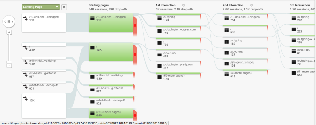
Since showing this type of information visually gets complex, Google doesn’t start by showing every connection. If you want more or less detail, just adjust the slider in the “Level of Detail” menu.

You can mouse over any box and view the total number of sessions along with the amount of through traffic and drop offs there were. You can also arrow over to the right and add more interactions to the chart by clicking on the “Step” link.
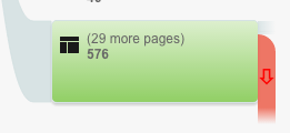
You might notice that the last box in each column doesn’t specify a page name and instead says “# more pages”. If you want to see those pages in detail, click on the box and then on “Group details.” This will bring up a pop up window that lists each page, the number of sessions, percentage of traffic and drop-off rate.
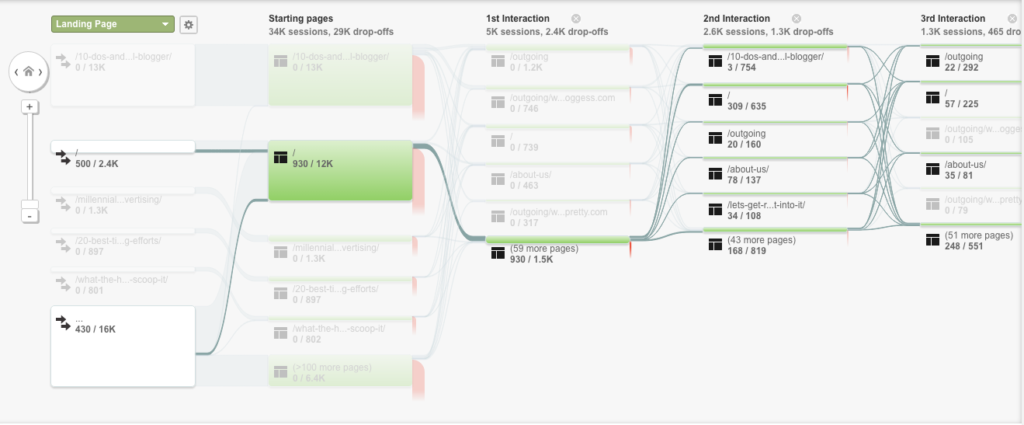
This data can be confusing to look at all at once, so I recommend honing in on a starting point you’re interested in, and clicking on it. This will pop up a box where you can choose “View only this segment.” This takes away all the unrelated pages and interactions.

You can also choose “Highlight traffic through here” which will darken the coloring across all pages and interactions related to that one, and screen back all the unrelated pages and interactions.
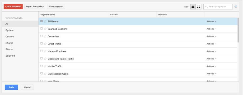
There are many other features you can use to get even more specific with this report. Click on “All Users” to change the user segments that are shown. For example, you might want to see data based on mobile users only. Uncheck “All Users, check “Mobile Traffic” and then hit “Apply”.
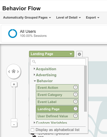
By default, the “Landing Page” dimension is selected in this report, but you can change that by selecting another option from the green dropdown menu. For example, choosing “Source” shows you the flow of traffic segmented by the source it came from (Google, Twitter, Facebook, etc).
How do I make sure I’m looking at the right data?
Reports like these can be fun to play around with, but if you don’t do anything with the data, they’re a waste of time. Start by identifying any major problems (high dropoff rates, low number of interactions in a specific flow, etc) and then go to the source: your website.
Take yourself through the same flow that you flagged as problematic. When you do this, you can start to see things through the eyes of your audience—and then you’ll be better equipped to make your website a better experience.
Want to take another step that will transform your school’s website? Sign up for our Story Audit Challenge, a free 5-lesson email course that will help you review, organize and transform your school’s website.
MORE ARTICLES
-
 The Hidden Gap Between Your Mission Statement and Enrollment Growth
 -
 Why “Strong Academics & Caring Community” Aren’t a School Story
 -
 Busy, Scattered, Exhausting: What’s Really Wrong With Your School Marketing
 -
 Why Most Schools Don’t Actually Have a Clear Story
 -
 Clarity in 50 Words or Less: How to Write Your School’s One-Sentence Story
 -
 What Should Your School Do with Its Blog Now That AI Is Changing Search?
 -
 What Is Your Private School’s Bold & Unifying Big Promise?
 -
 AI Writing Prompts to Power Private School Storytelling
